Procurement Practices

How visual cues boost user experience in construction procurement apps
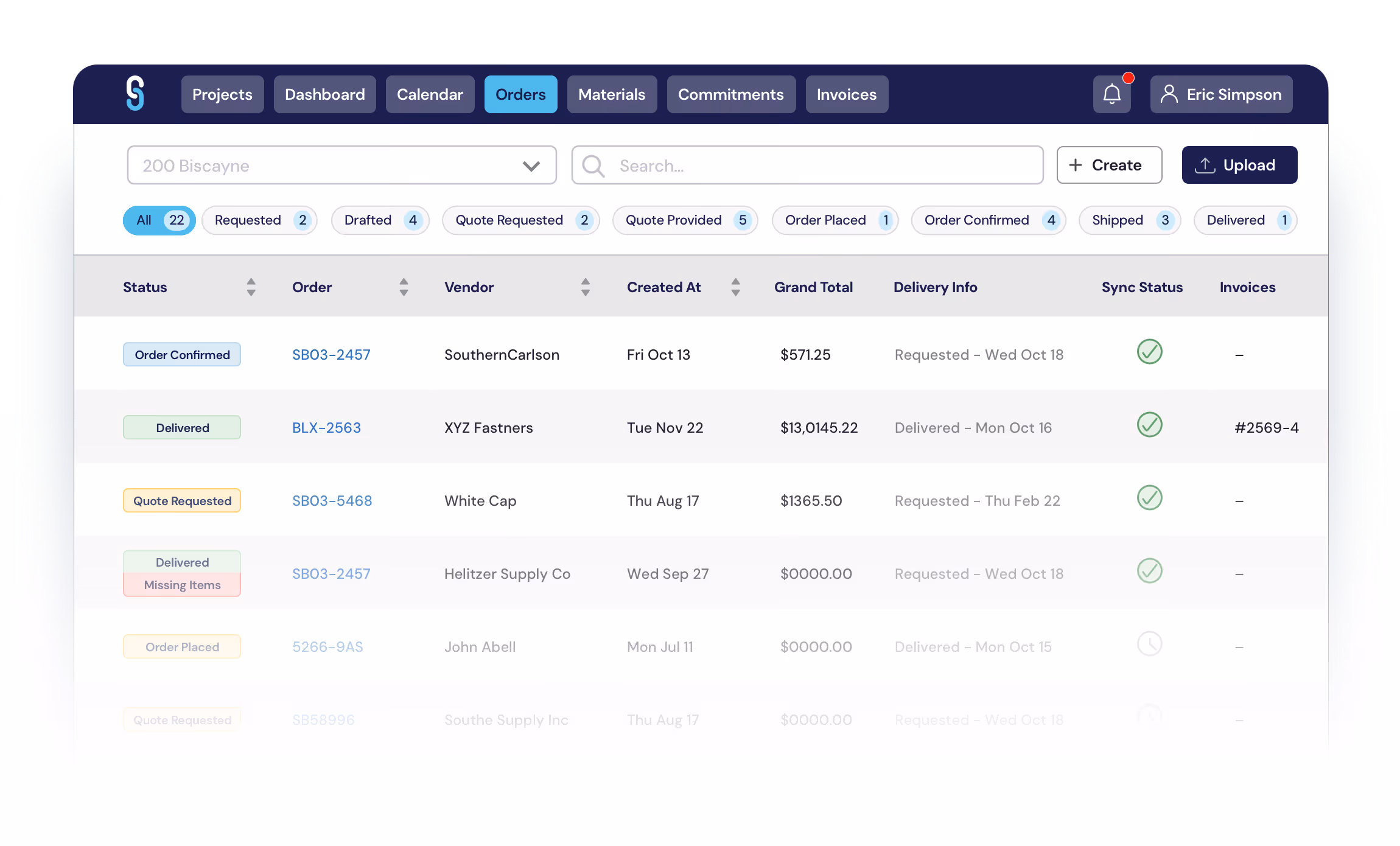
Eric Helitzer
,
February 23, 2026
Construction teams need a procurement app that feels as intuitive as ordering a ride-share. When foremen and office staff can instantly recognize what to do, errors drop, speed rises, and projects stay on budget.
This guide explains why visual cues matter, where traditional tools fall short, and how to embed clear, actionable signals throughout your app. If you manage subcontractors, self-performing general contractors, or field crews across the United States, the tactics below will help you design an interface that users can navigate without a manual.

The core problem

In many construction firms, procurement still relies on spreadsheets, email threads, and phone calls. Those legacy methods lack a shared visual language, forcing users to interpret raw data or ambiguous button labels. A foreman in Miami may receive a PDF order list that looks identical to a vendor invoice, leading to missed deliveries or duplicated purchases. Without consistent visual cues, users waste time confirming details, double-checking quantities, and asking colleagues for clarification. The result is a cascade of delays, higher labor costs, and frustrated stakeholders who cannot quickly verify whether an item is “ordered,” “in transit,” or “delivered.” The problem intensifies on mobile devices, where screen real estate is limited and users depend on immediate visual feedback to stay productive on the job site.

Why current solutions fail

Most off-the-shelf construction apps focus on feature depth rather than visual clarity. They bundle dozens of functions behind nested menus, use generic icons, and apply color schemes that blend into the background. Because these solutions were not built with field-first ergonomics, they ignore the need for distinct visual cues that differentiate status, priority, and required actions. Additionally, many platforms lack adaptive design, so a button that appears bright on a desktop may become muted on a rugged tablet under bright sunlight. The end result is an interface that feels “clunky” rather than “click-ready,” prompting users to revert to phone calls or paper forms – exactly the behavior the software was meant to eliminate.

Leverage consistent visual language

Start by defining a visual cue palette that applies across the entire app. Assign a specific shape, color, and label to each core action – such as ordering, approving, or reporting an issue. For example, a green rounded rectangle can always represent “Submit Order,” while a red triangle signals “Error” or “Missing Information.” Consistency ensures that when a user sees a green button on the dashboard, they instantly know it will move the request forward, regardless of the screen they are on. This approach reduces cognitive load and aligns with the way field crews already interpret safety signs and equipment markings on construction sites.

Implement color-coded status indicators

Color is a powerful visual cue that conveys status at a glance. Use a limited palette – green for “Delivered,” amber for “In Transit,” and red for “Delayed” or “Issue Reported.” Pair each color with a subtle icon (checkmark, hourglass, exclamation) to accommodate users with color-vision deficiencies. When a foreman opens the “Orders” tab, the status bar instantly tells them which shipments need attention, eliminating the need to read detailed logs. According to a 2024 web-design study, 61.5% of users abandon pages when navigation cues are unclear, underscoring the importance of clear visual hierarchy.

Use iconography for actionable buttons

Icons act as visual cues that transcend language barriers and speed up decision-making. Replace text-only buttons with universally recognized symbols: a truck icon for “Ship,” a camera for “Upload Receipt,” and a clipboard for “View Quote.” Position these icons consistently – always left-aligned with the label – so users develop muscle memory. In a recent field trial, teams that adopted icon-driven buttons reduced order-entry time by 23% compared with text-only interfaces. The icon set should be lightweight, high-contrast, and tested on both iOS and Android devices to ensure clarity under construction-site lighting conditions.

Integrate real-time feedback overlays

When a user taps a button, an immediate visual cue – such as a spinner, progress bar, or subtle pulse – confirms that the system is processing the request. Without this feedback, users may tap repeatedly, creating duplicate orders. Implement overlay cues that disappear once the action completes, and pair them with concise toast messages (“Order submitted”) that reinforce the outcome. Real-time feedback also helps compliance teams meet ADA requirements for accessible interfaces, as the Americans with Disabilities Act mandates perceivable indicators for interactive elements.

Design adaptive layouts with visual hierarchy

Responsive design must preserve visual cues across devices. Use larger touch targets and high-contrast colors on tablets, while maintaining the same cue hierarchy on desktop dashboards. Prioritize the most critical actions at the top of the screen and use whitespace strategically to separate unrelated sections. When visual cues are spaced appropriately, users can quickly scan the page, locate the needed function, and avoid accidental taps. A study of U.S. e-commerce sites found that proper visual hierarchy can lift conversion rates by up to 15%, a principle that translates directly to procurement efficiency.

Common mistakes to avoid

Even seasoned designers slip into pitfalls that dilute the power of visual cues. Below are the most frequent errors and how to sidestep them:

  • Overloading with colors: Using too many hues confuses users; stick to a limited palette of 3-4 primary colors for status and actions.
  • Inconsistent icon placement: Changing icon positions forces users to relearn the interface; keep icons in the same location across screens.
  • Neglecting accessibility: Relying solely on color fails users with color-vision deficiencies; always pair color cues with shapes or text.
  • Missing feedback loops: Without a loading spinner or confirmation toast, users assume the app is unresponsive and may duplicate actions.
  • Designing for desktop only: Field crews use rugged tablets; failing to adapt visual cues for smaller screens leads to missed taps and frustration.

Real-world example

Subbase.io recently onboarded a mid-size general contractor in Dallas who struggled with order visibility on their mobile app. The client asked, “Are we going to be able to access the app or actually push buttons or anything in a test environment on the mobile app?” By introducing a set of visual cues – green “Submit” buttons, red “Issue” icons, and real-time progress overlays – the team reduced order-entry errors by 38% within the first month. Foremen reported that they could confirm a delivery status with a single glance at the color-coded badge, and the office staff saw a 22% drop in clarification emails. The contractor also linked to Keeping Material Management In The Field Simple as a complementary read on simplifying field workflows.

FAQs

1. What are examples of visual cues?

Examples include color-coded status badges, icons on buttons, progress spinners, toast notifications, and shape-based alerts such as triangles for warnings. Each cue provides immediate, perceivable information that guides user actions without requiring extensive reading.

2. What is a visual cue?

A visual cue is any graphical element – color, shape, icon, animation, or layout pattern – that signals meaning or prompts a specific response from the user. In procurement apps, visual cues help users identify order status, required actions, and system feedback instantly.

3. How do visual cues improve procurement efficiency?

By reducing the time spent searching for information, visual cues enable faster decision-making, lower error rates, and fewer clarification calls. Teams can move from “I need to check the spreadsheet” to “I see the green badge, so the order is confirmed.”

4. Are visual cues compliant with ADA standards?

Yes, when paired with text alternatives or shape distinctions. The ADA requires that interactive elements be perceivable, so combining color with icons or labels ensures accessibility for users with visual impairments.

5. Can visual cues be customized for different projects?

Absolutely. You can assign project-specific colors or icons to reflect unique workflows, as long as the core visual language remains consistent across the platform to avoid confusion.

Conclusion

In the fast-paced world of construction procurement, visual cues are the silent operators that keep teams aligned, reduce errors, and accelerate workflows. By establishing a consistent visual language, leveraging color-coded status indicators, employing clear iconography, providing real-time feedback, and designing adaptive layouts, you create an app that field crews can trust without a tutorial. Subbase.io’s experience shows that when visual cues are thoughtfully integrated, productivity climbs, communication drops, and projects stay on schedule. Ready to transform your procurement experience? Explore our platform and let visual cues work for you.

Stay in touch

Sign up for our monthly newsletter to receive exclusive company updates, learn about industry trends and find out where we will be next. Don't miss out – subscribe today!

Streamline your process see SubBase in action

Request a Demo